Showing posts with label home sweet home. Show all posts

aden + anais

I've been putting this off for far too long, and it's really getting around that time when I need to start making my list for all the things we need for the baby. 

First thing to go on my list--and really the first thing that got me excited about all the impending shopping--is aden + anais. All the products are made of muslin, and quite frankly, I want them all! Baby will be born in the middle of summer, so light, breathable muslin sounds just right. And once the colder months arrive, I can always switch over to their classic dream blankets, made with four layers of muslin.

Not to mention, they're stinkin' cute. What I love most of all about aden + anais are the colours and prints. Very soft, simple and understated. I especially love the classic collection.
(Am I the only out there that's over all the garish colours and prints they use for baby stuff?)


And guess what?! They have a line of blankets, albeit a very small line, for the home! So mum and baby can cuddle up comfortably, even on those hot summer nights.


bringing home gold

Before we moved in to our new place, I spent ages scouring interior design magazines and websites for inspiration. The one thing that I never hesitated on was the powder room. It's quaint (i.e. tiny), so I knew I wanted a huge impact.

We decided we would go super dark walls, gilded accents and a stunning wallpaper for that back wall. We thought we knew exactly what we wanted... All we had to do was find the wallpaper. Fun, right? Wrong!

I considered, bought and returned so many rolls... I thought I had finally settled on one until the other day, when I looked at it and decided that I was over it.

A few weeks later though, I found it. The perfect wallpaper! All grey and gold, calming yet lively. It was just what I was looking for!

The Wabi line from Rachel Mosler and Nick Cope's Calico collection, meant to convey the feel of water flowing over pebbles, has just the right amount of metallic sheen to add the impact I wanted!
If you're looking for something with even more drama, check out the Night line, which "conjures the feeling of obsidian shimmering in the moonlight".
Or Lunaris, if space is more your thing.
Either way, you gotta admit they're all pretty stunning. For more info, visit New Wall's website.


a trip to ikea later

 As planned, I have already started making some small changes around the house. I'm trying to keep the cost low and the impact big. 

First thing on my to-do list was a table for the entrance. Something that suited the space without closing off our entrance. It had to be longer than our tiny bookshelf, but thinner. A glass console table fit the bill perfectly. After browsing a couple of Home Sense's, I turned to ubiquitous Ikea

 The Vittsjo laptop table wasn't perfect, but the price was right (more than right, it was way below budget!) and it was too fitting to refuse. I wanted to keep my Beatles print, but add some green elements to tie everything together with the living room. 

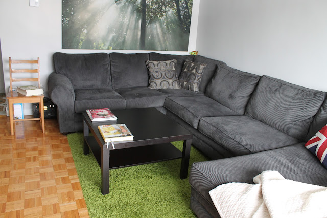
 Our couch may not be elegant or refined, but it's the most cozy, comfortable piece of furniture I have ever had. I love the corduroy and I love the colour. It's massive so I wanted to offset that with a round and airy table.

 So keeping in the same model, I got the Vittsjo coffee table. Round, thin with a glass top. I was worried it would diminutive, but I think it highlights our couch's cushy, while complementing it's bulky frame.

And I threw in a new side table for good measure.

I wanted to avoid Ikea as much as possible. Don't get wrong, I love those Swedes. But there comes a point where it's enough. Hopefully, we haven't reached that point, but the great thing about the Vittsjo pieces is that they can be easily re-appropriated or totally revamped. I'm looking at you, Ikea Hackers.


where i make a plan, sorta

 I've been in a bit of a slump lately. I'm in a transition period and everything feels unsettled. My home, my finances, my career, my priorities are all changing—or about to.

While I can't avoid the motions of starting a new job or the responsibilities that come with growing up, I can settle my home situation.

As I've mentioned in a previous post, we're entertaining the thought of buying a house, so it seemed wasteful and counterproductive to change the floors and revamp the kitchen in our current home, but if the Internet has taught me anything, it's that giving a room a new look can involve some small tweaks and a few reasonable purchases.

I can't change the 1970s tiles in our foyer? That's alright. I can cover them with a surface rug that can be easily moved! Maybe ripping our kitchen out and starting from scratch is too pricey. Fine, I'll paint the cupboards and change the hardware myself!

I've got lots of plans, and some are frighteningly ambitious. I've decided that instead of worrying about how I can screw up, I'll focus on what I can accomplish. I didn't see it for it was before: the perfect opportunity to learn! A drawing-board home as practice before we move in to the real thing.

To start, I've started (belatedly) to do Apartment Therapy's January Cure. It's pointed me in the right direction and now I have the outline of an idea.

How's that for direction? An outline of an idea. Very fleshed-out.

I'll be documenting my projects here, big and small alike. I hope you check back in from time to time to see how it's coming along.
 
Maybe by the end I'll have a great looking kitchen with lots of light and a modern feel.
 Hey, a girl can dream.


{images: design*sponge}

sometimes we love what we don't like

(And I'm not talking about family members.)
As I scrolled the posts on the Kitchn, I came across Leela & Dave's Imperfect Kitchen. It caught my attention because the first picture had a) a woman I assume to be Leela looking adorably disheveled in pj's and a robe and b) the kitchen reminded me a whole lot of my kitchen in my old apartment. 

I need to preface what comes next by admitting that I hated my old kitchen. I hated the ugly countertop, the faded linoleum floor and the stupid cabinet doors that just wouldn't close.

Now, looking at Leela and Dave's kitchen I feel like I may have been a little hard on that old kitchen, a little quick to overlook its innate charm. 

I don't particularly like this kitchen, but I do love it. Like my old kitchen, it has tremendous potential to be a "magazine kitchen" if you're willing to invest in a complete overhaul.

Home decor magazines and blogs have made my expectations way too high. This post reminded me that while you need a space you love to be happy, that space shouldn't need to be defined by designer standards. It's important to strike a balance between your style and your lifestyle. Having lots of shiny stainless steel and pristine glass may look really nice when its brand new, but fingerprints happen. 

We shouldn't sacrifice the comfort and homeyness of a messy, imperfect kitchen for the sometimes impossible standards we set for ourselves.

And when I say "we", I really mean me.


{images: the kitchn}

pipe down

 I've been coming across a lot plumbing pipe furniture in the past few days. I don't if this is an upcoming trend. Or maybe I just missed the bandwagon. Regardless, I really like what I see! 

I'm sure you've all seen the pipe shelving—even if you haven't, the Stolmen line at Ikea seems to have been inspired by it, and I know you've all seen those! But I'm talking full-fledged furniture! Chairs, benches, tables and beds just to name, well, most.And there are tons of downloable DIY plans available online. 

If you're feeling crafty and know what epoxy copper and a boring bit are and have a couple of sawhorses lying around, I strongly encourage you to Google-search it and make one! 

Then, I—again—strongly encourage you to send it on over my way, or at the least tell me what a boring bit is... oh, and lend me your sawhorses.

I especially adore this DIY featured on Martha Stewart! I've been wanting a bench for our narrow entrance, but was worried too crowd it. This hands-on approach would allow for some customized tweaking.


bottom line

So that wraps up kitchen week. While it was far from comprehensive—or very methodical—I hope you were inspired to think of new ways of bringing some panache to your kitchen. I know I was! Mom rules are out the door for me! Can't put a couch in my kitchen? Pfft! As long as you go with something you love, you can't go wrong. That's what I really hope you took away.

And if you're really lucky, you'll end up with a kitchen with amazing bones like this one! Look at all that natural light. Beautiful!


comfort zone

I absolutely love the idea of jazzing up an otherwise plain kitchen by adding some cozy elements. A nice bench, a couple of comfy chairs or a few throw pillows can really do wonders!


{images: fjeldborg}

a kitchen with personality

 Kitchens are filled with all those useful items that make our lives that much simpler; a dishwasher, a microwave, a garbage can, and all that other semi-boring stuff ("semi" because sometimes I get excited about stuff like a nice garbage can, ok? Don't judge). 

Just a couple of weeks ago, the idea of putting a framed artistic print, or a pretty bauble in the kitchen seemed counter-productive. Kitchens rarely ever have much space to display items some may judge superfluous. But I think it's important to make it a priority. I'm not suggesting you sacrifice your blender for grandma's silver teapot, but maybe instead of 3 coffee machines, a toaster and a panini press, a vase of flowers could go on your counter.

Making room for the things we love next to the things we need can go a long way in making a space more welcoming and distinctive. 

A colourful basket, a pretty print and some flowers really add life and colour to this lovely kitchen without cluttering it (found on Going Home to Roost).
It's the peculiar that will get your guests talking on a Saturday night, and make you smile Sunday morning when you're cleaning up with a hangover.


pick your style

I've always had a hard time incorporating my style in the kitchen, because I subscribe to the go-big-or-go-home way of life. If I want to change my kitchen, it usually entails lots of renovating and money, and probably some strangers in the house, too.

Picking out a new kitchen is a huge decision, and if you want to do it right, investing time before money can save you lots of frustration in the future. I, for one, am drawn to many different styles, and choosing oneand sticking to ithas always proved to be a huge challenge. So my best piece of advice is take the time to look at tons of kitchen—get ideas, get inspired, make a scrapbook, whatever—just make sure to choose something you'll love for a really long time.

And that's where you need to start: picking your style. There's a plethora of choices—industrial, French, feminine, contemporary, minimalist,  bistro, romantic, traditional, rustic, country, 
eclectic, bohemian. And you can mix and match! Here's a few of my favourite:

Modern country meets rustic comfort

Industrial elements in a traditional setting
Romantic and feminine with a touch of whimsy


{images: cococozy}
{austin patterson disston}
{bijou and boheme}

kitchen week

This week, I want to focus on kitchens. I will share my thoughts on making
the kitchen the focal point of your home and bring you ideas on how to make a space that you can truly enjoy.
 I remember when I was a kid and I was allowed a small glimpse of my parents' diner parties before bedtime. Guests sat around our Swedish teak table laughing and talking, while my mom spent entirely too much time in the kitchen preparing various courses and cleaning.

 The purpose of kitchens has changed. Guests are no longer relegated to the dining room or living room anymore while their hosts keep busy in the kitchen. Now, the kitchen is where it's at. People sipping wine around an island while their hosts entertain and put everything in order for the meal to come. Even cooking has become a social activity. Kitchens are where memories are being made nowwhere you chat and hang out with friends and family, where your kids do their homework and tell you about their day. 
 
The home dynamic has shifted from when I was a kid, but many of us still keep our kitchen decor cold and utilitarian. Instead of investing a lot of time, effort and money on prioritizing our dens and bedrooms, the focus should be on the kitchen.It should be a place that reflects your personality and evokes the feel of a home: inviting, warm, comfortable.

My parents' generation preferred to hide the dirty dishes, mail, the various and the sundry in the kitchen. But I don't mind leaving some things out. My home is where I live, where I make messes and where I sometimes get lazy and leave a a dirty dish or two on the counter. I believe that if my friends see that I don't take myselfor my housetoo seriously, then they will see my home as a comfortable place they will want to come back to. Just like myself, I want my home to be feel open and friendly.


{images: home decor interior ideas}
{apartment therapy}
{welcome to the bakery}
{bijou and boheme}

declutterifying


After a good month of shirking all my house cleaning chores, I came from the honeymoon to realize that the house was in dire need for a good spring cleaning. Since I'm not going to wait for spring, I have made it my duty to introduce fall cleaning to the world. 

At first, I wanted to get rid of everything! Throw away the nic nacs, cleanse the closets of all the duds, ditch the CDs, DVDs, donate the books from college. Now, what I wanted and what happened are two entirely separate things. I just don't have the heart to throw away the first teddy bear Rob won for me at the carnival, or fill a bag with clothes I haven't worn in years. Sure, I hate that green turtleneck now, but my likes and dislikes are a constant roller-coaster.

I was beating myself up one morning, when I came across a book. It wasn't the book itself, but the title that struck a chord - A Perfectly Kept House Is the Sign of a Misspent Life by Mary Randolph Carter. How very true - and fitting. "My new motto", I thought to myself. So, my house isn't the pristine, shiny, stark abode the magazines make me believe it should be. Life is messy, why can't my home? It's clean, it's cozy and lived-in. 

Isn't that what makes a house a home?


{photo credit: emma's blog}

mint & yellow makes mellow

Since I bought these mint-coloured pants, I have been obsessed with the colour!Mint clothes, mint shoes, mint polish, mint furniture – I love all of it. It'sversatile and contradictory; a touch vintage, but refreshing, vividyet soothing. And it pairs up well with so many colours. My fave combinationright now: mint and yellow.


{click on photo for source}